evee
Driving the future with UX
Connecting Electric Vehicle (EV) enthusiasts
and eco-conscious drivers with easily accessible information, so they can experience driving the
future with ease.
Team
Four UX Designers
Platform
Mobile Site
Timeline
4 weeks (remote)
My Role
End-to-end UX Process, Time Management
Deliverables
Clickable high-fidelity prototype
Market & User research findings, Project roadmap, recommendations and next steps.

Our
Client
evee is Australia’s only 100% electric
car-sharing platform with over 120
cars in its fleet across Australia.
evee makes driving the future achievable for EV enthusiasts and eco-conscious drivers by allowing them to experience an affordable, innovative, sustainable alternative every day.

Challenge
evee tasked us to investigate their
onboarding processes, identifying user
journey pain points to help resolve the
following problems :
-
Reduce drop-off rates in the booking flow
-
Increase the current conversion rate of 2.24%
-
To design a mobile-first responsive solution.
Business Value
If we create improvements throughout the booking flow and provide more onboarding assistance, we expect to achieve a better uplift in conversion rates -increasing from 2.24% by 0.7%
(within 3 months of recommended rollouts).
In order to do this we need to conduct thorough user research to better understand the problem, and reveal opportunities - so we can build the right solutions.
Problem
User needs transparent information when hiring a car so that they aren’t confused or surprised.

Outcome
Our research identified specific pain points as soon as users entered the site, resulting in a snowball effect as they progressed through, affecting their ability to make informed decisions.
Although the evee site provided users with lots of information, it wasn't always easy to find or easily digestible, leaving users anxious and frustrated.
Our mobile-first solution, therefore,
focused on providing users with transparency beginning with a
restructuring of the homepage and
data-driven recommendations for
the booking flow.
The Kick-off
evee provided us with the following collateral: Brand Guidelines, Brand Strategy, Google Analytics,
2019 Survey Data and access to their customer database.
However, before diving heavily into any research, we needed to meet our stakeholders to learn more about the business, their needs and their goals. The brief and collateral provided us with many insights; however, there was a lot we were still curious about and keen to ask. Before our kickoff, we crafted an agenda together.
We then conducted a task analysis and usability tests on the existing site because we wanted to understand how the site works, familiarise ourselves with the content and learn more about our user's journey.
These initial observations help guide and craft targeted questions
for the evee team, such as:
1.
What do you think may be the cause for cart abandonment?
2.
What solutions has the business attempted to resolve the problem?
How effective was it?
3.
What are Evee’s Business goals / expectations?
Documenting our problem space
When we prepared our team charter, which outlined our team's mission, goals, values, expectations and purpose, I expressed my interest in using the Lean UX canvas for our project. I was keen to explore and learn more about this collaborative, agile tool, designed to help project research, design and planning through its "big picture" approach. The tool helps to reveal business and user needs and goals quickly, which would help guide us and keep us focused on building the right solution. We introduced the Lean UX canvas for our post-kick-off meeting to visualise our challenges, assumptions and goals.

Key Post Client Meeting Curiosities/Assumptions
01
We learned there were constraints within the flow that could not be changed. How can we manage these technical constraints?
02
How does the evee conversion rate compare with their competitors?
03
Perhaps more information should be provided for: rental Insurance, car charging, pickup & drop off locations, airport charges/collection and evee's discount structure.
04
Some information was difficult to find on the site, and/or too much information was provided, which could be overwhelming. Host postings are not uniform. Does evee provide car profile guidelines that their hosts can follow when posting their cars online?
05
Evee was designed to empower people to experience the excitement and possibilities of electric vehicles - to be the preferred car rental alternative.
We have observed the website is experiencing a high abandonment rate during the booking process which is resulting in decreased conversions.
We believe we should review the booking/sign-up process (specifically - eligibility, insurance questionnaire- driver details) to ensure users are well informed. Success is defined as an increase in conversions by 0.7%.
Was there a problem with the booking flow?
How did users discover the site?
What are similar services doing and
What do their booking flows look like?
Understanding the problem
To better understand the problem and our users, so we build the right solution for the right people, it was essential, to begin with a combination of research methods.
Explore

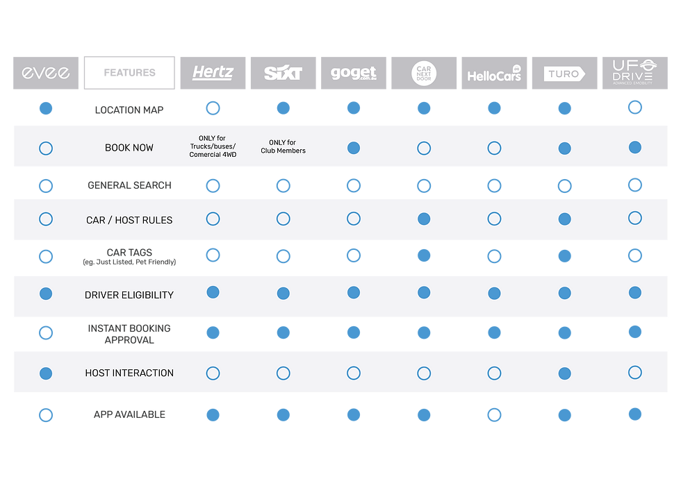
Competitive / Comparative Analysis We identified seven competitors and three comparators which we thoroughly analysed by conducting a feature inventory, task analysis of features and booking flows as well as a plus/delta review to identify patterns, strengths, weaknesses and opportunities.
Google Analytics Access to this quantitive data provided us with great insights that we analysed with a holistic approach. We believed it was important to be data-informed and not data-led. We would use these findings in conjunction with all other research.


Site Audits & Usability Tests We conducted seven usability tests on the current platform to assess the product's performance and gain a deeper understanding of the content. We documented our usability results and task analysis on a google sheet.
Site audits were split between us.


Market Research Consisted of a review of the electric car industry by reading published articles, business reports, analysis of electric car models/trends, the broader car rental landscape, and external factors influencing the market.
"...more Australian households than ever considering an Electric Vehicle
for their next purchase..."
source: EV wait times in Australia are a big problem that needs addressing. September 10, 2022 techau.com.au
Key Market Insights


What's it like driving an electric vehicle?
By this stage of the project, we were
keen to get behind the wheel - so we did!

Driving the Future
Contextual Inquiry
Site
Tesla Richmond, VIC
EV Status
Newbie
When
September 2022
Excitement
10 / 10
Model
Tesla Model Y
Nerves
Off the scale


What better way to get a feel for a user's experience than to "drive" right in?
As soon as we arrived, we were warmly greeted by staff and encouraged to get behind the wheel to truly understand the technology and driver appeal. Being a newbie to EVs, I honestly had no idea what to expect and was instantly taken in by the minimalist, sophisticated design and innovative features.
I was nervous; however, being second to drive, I could observe the car's many quirks. The interface was huge, and we were all in awe of the regenerative braking and other features such as pet and summon.
The test drive and a chat with one of the Tesla Advisers provided us with the following insights...
Key Field Insights


What do people really think or know about
electric vehicles? Time to talk and listen to users...
User Research

We conducted 25 - 1:1 user interviews with 11 evee renters, 13 non-evee renters and evee's Customer Service Manager. All the interviews were organised through Calendly (by evee) and recorded in Dovetail to give us access to each other's findings so that we could synthesise the data with ease later on. It was essential that we speak to both existing evee users as well as non-users to gain a deeper understanding so we could reveal a range of behaviours, motivations and user expectations. We wanted to learn...
1.
What do people know about EVs?
2.
How do people feel about the shared economy model?
3.
What do users look for, when they are booking? What influences their choice?
Take 1...Take 2...Take 3
Define
What we anticipated to be a reasonably straightforward exercise to facilitate our synthesis of affinity mapping- became a lesson learned. Having all of our interview transcripts on Dovetail was fantastic. Tagging was a dream until Houston; we have a problem.
We discovered that many of our tags needed to be revised due to uncertainty around "tagging" best practices. We needed to ensure we extracted the crux of what users were telling us.
We needed to STOP - REFLECT - ITERATE to ensure we were highlighting user behaviours, observations and motivations that would inspire action.

We had many insights to sort collaboratively, which became more manageable once we simplified our process. We began to see patterns and trends emerge through affinity mapping, which I suggested we categorise into theme frequencies to aid in identifying our key insights. I created a spreadsheet using our existing affinity map labels and subcategories.
I then tallied the total number of insights for each category and recorded how many different users had mentioned these insights. I highlighted the most common themes, which had insights from at least six or more different interviewees. The visual layout helped us quickly review and collaboratively discuss the key insights from our user interviews.
A snapshot of the key theme frequencies we uncovered may be viewed below...

" How far can I go? "
Range Anxiety | User Interview Participant
" I really want to buy one. She said you're not buying one until I get to drive it. "
Try before I buy | User Interview Participant
" I was just stressed about charging
and couldn't find the information online. "
Missing Info/Issues finding info | User Interview Participant
Key User Research Insights


Our research did validate and
disprove some of our assumptions
around user behaviour.


Building Empathy...
Whom should we be designing for?


It was time to build our personas which would help guide our decisions throughout the design process and provide us with a deep understanding of our target audience.
To identify our users, we analysed our qualitative and quantitative research.
Although evee provided us with their Brand Strategy deck that included four determined archetypes,
we created our own - informed by our newly researched data. We chose to initially work through this independently, curious to learn how we each determined our proposed user - we then presented our results to each other for open discussion. We found many similarities, which we then collaboratively identified and defined into two archetypes, Mateo & Steve by their respective demographics, behaviour, needs, goals and frustrations.
Which user to focus on?
A common theme for both users was the need for clear information and transparency throughout the booking process so they could make informed decisions. We began to plot our user's journey to understand specific pain points better, reveal opportunities and provide us with a holistic view of the customer experience.

Time to walk in Mateo's shoes

Opportunities
-
Review navigation. Ensure new users/renters know where to go
-
Review delivery options.Explain and/or clarify how delivery works.
-
Review insurance details so users do not feel misled and policies are transparent.
-
Review and explain licence verification and handover processess (including host return policies)
1.
How might we...
lessen cognitive load and booking requirements so that users understand what to expect?
2.
How might we...
improve the onboarding process for new users?
3.
How might we...
create a booking process so incredible users tell all their family and friends?
Generating Solutions


We used the Crazy 8 Design sketching exercise to generate innovative ideas for the Homepage, Product Listing Screen and Car Search Page. Our sessions consisted of 3 rounds :
1st & 2nd Round - 8mins, producing 8 designs each
Final Round - 10mins, producing 1 detailed design
Sharing, Critiquing, and Voting following each round on all ideas.
Crazy 8 Suggestions


Improving visibility


With our user's need for transparency always in mind, we revisited and analysed our site audit research. We reviewed evee's user flows and content and numerous comparators to reveal potential opportunities to streamline the process and avoid ambiguity in our designs- so we could deliver a better user experience.
Main learnings from our analysis...
-
Pick Up / Delivery could be refined on Product Page
-
Improve visibility of "Car Model Search" on Homepage
-
Manage constraints - keeping users in the loop
Designing for transparency


Paper sketching provided us with quick interactions prior to wireframing and prototyping.
Our sketched designs focused on improving transparency on the home page and booking flow by a re-structure of the layout, content and hierarchy.

In order to quickly prioritise all our ideas - collaboratively, we chose to use an impact effort matrix to rank and plot our proposed features. This visual aid validated that our next step - our initial focus should be with restructuring the evee homepage.
If we include "how car sharing works" then
new users will understand the process and feel
more comfortable using the service.
Homepage | Hypothesis
If we include potential "user experiences", users
can visualise themselves using the service.
Homepage | Hypothesis
Wireframing & Prototyping

Iterating our Designs


Existing Homepage
Communicating Proposed Structure
We tested our prototype, which consisted of our newly restructured homepage, as well as recommended revisions to the product page, and navigation to determine whether users could successfully complete the four tasks they were assigned.
1.
Book a car using your smartphone
2.
Find evee's insurance policy / information
3.
Locate communication from your host
4.
Locate charging information

Sounds like insurance is covered; why then "get insurance"?
3 out of 5 users initially searched for this information in the Hamburger menu, and 1 expected to find this info in faqs.
All users completed this task, however, one, in particular, was perplexed by the call to action to "Get insurance" if users are already covered. CTA needs to better reflect the task, in this case provide more information.

I would expect to find
this is the menu...
Users in testing relied on the search tool and hamburger menu to obtain information. We needed to ensure our
categories were intuitively labelled.
Eg: Insurance info

Why can't I book now? It's saying I can book this car but it's not instant...
Messaging is inconsistent with action.
As bookings are not instant, call to
action needed to reflect this.
Our Solution


Next Steps

Further testing of our recommendations followed by the implementation of our proposed solutions.
We also crafted a high-level project roadmap that prioritises the problems and initiatives
we recommend the evee team work on in the future to improve user experience and achieve desired business goals.
Update: evee are currently working on the implementation of our suggestions.
Learnings + Takeaways
•
We did not expect the biggest pain point to be around transparency, our research validated this finding.
•
Small changes can make a big impact on the performance
of a product and/or service.
•
Important to trust the process. Our research led us towards
a different solution to the one originally proposed.
•
Communication is key. Be curious, facilitate discussion and embrace the unknown.
Let's make something
fun together!
